

Adjusting to the New Wider Layout
As part of the WordPress update on Tuesday, June 2nd, the content width across the platform will be expanded from 1000px to 1440px. Font sizes will also be increased slightly to improve readability and better use modern screen sizes.
Most pages should transition smoothly into the wider layout without requiring any changes. However, because this update affects thousands of existing pages and content patterns, some layouts may benefit from refinement after launch.
Users working on smaller laptops or monitors with screen resolutions below 1440px wide may experience more dramatic layout changes, as the site will shift into tablet-style responsive layouts more quickly.
This guide covers the most common adjustments we expect users to encounter.
Image Sizes
One of the most noticeable changes in the wider layout is image sizing. Images that previously filled a section may now appear smaller relative to the available space. Here are solutions:
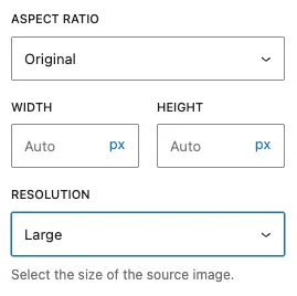
- Upload a replacement image at our new recommended sizes.
- Center the image in the space.
- Choose a higher “Resolution” if you originally used one of our smaller pre-sets.
- Force the image to our new recommended sizes using the “Width” option, but this may create a pixelated image.
- If your original graphic was provided by UMC, or you are not comfortable resizing graphics yourself, contact us using the Web Request Form.
Staff List Images
If you’ve updated your Staff Listing Block to one of the grid layouts, your very old photos may be too small and will display pixelated.
You can request new versions of existing photography and resize them to 500px x 500px, or this may be an opportunity for your team to take new headshots. Adjusting to a 4-column grid from a 3-column grid will also help your smaller images.
Text Flow
We are aware that areas of text that may have been thoughtfully aligned before may now wrap awkwardly in the wider width. You may need to re-edit your content or drag paragraphs between columns to create a more balanced layout.
We understand that this may be frustrating for pages that were carefully arranged over time. While some pages may no longer flow exactly as originally intended, the underlying content and structure of your site remain intact as everyone adjusts to the wider layout.
University Events Block
The images provided by the vendor that powers the University Events Block are currently limited to 300px wide. In the previous layout, displaying three events in a “wide” row generally provided the best image quality and balance.
With the new wider layout, you can now display up to four events per row while maintaining similar image sizing. If you would like to adjust your layout, you can update the block settings by increasing the “Number of Events” from 3 to 4.
Need Help?
If you encounter issues after launch or would like assistance refining a specific page or design, please submit a request through the Web Request Form.
The WordPress Team will be actively monitoring feedback following the rollout and prioritizing larger issues as quickly as possible.
If you would like a non-public space to rework pages after the width update, you can request access to our pre-production (PPRD) environment through the Web Request Form. This can be especially helpful for sites with highly customized layouts or pages that may need more significant visual refinement in the wider layout.
- Your live public-facing site will remain online and unaffected while you work.
- Your PPRD site is not visible to the public.
- PPRD and Production are not automatically synced. Any updates made to your live site should also be made in PPRD if you want to preserve them.
- When you are ready to launch your updates, let us know through the Web Request Form. The WordPress Team will review the site for accessibility, best practices, and technical issues before moving changes into production.
Please allow a few business days for review and scheduling before launch.
Categories: Update