
Building a Page
This theme uses WordPress’s new Gutenberg block builder with a few customizations to meet the needs of Wake Forest’s users. You can follow along with the text instructions below and/or watch WordPress’s Intro to Publishing with the Block Editor video to get started.
Top Menu
Once you have created a new page and given it a title you’ll be presented with all your page building options. Here is are all the features of the top menu.
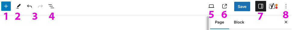
- Add blocks: Reveals a menu from the left listing all available blocks. Choose a block and it will be added to the page.
- Mode Select: Toggle between selecting (moving) and editing your blocks.
- Undo/Redo
- Document Overview: Displays a clickable outline of your page’s block structure. Very helpful for selecting specific groups and columns for changing widths and adding backgrounds. It also offers a page Outline, useful for checking the accessibility of your heading levels.
- Preview: Lets you view your changes before publishing.
- View Page
- Settings: Hides and reveals the right Page/Block menu, if you’ve accidentally hidden the menu this is how you add it back.
- Options: A collection of more advanced page settings
Switch to Draft: Returns a live page to a draft.
Publish/Save: Publishes your changes.
Page/Block: Toggles the right side menu between the page’s settings and your selected block’s settings.
Review Adding a New Page for page publishing options.
Blocks
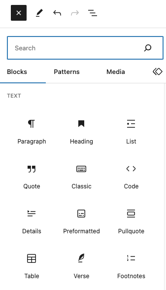
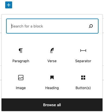
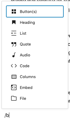
You can add a block to the page by clicking #1 above, clicking into the editing area then clicking the plus icon that appears or even typing a “/” and the name of your desired block. Here are all the available blocks in this theme.
Once you’ve added a block there will be a menu with a variety of block-specific options that appears both above the block when selected and in the right-hand menu under the Block tab. Below is the Pullquote block for example.
Block Menu
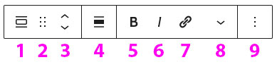
- Block Type: This icon shows what type of block this is, clicking allows you to change to other similar blocks.
- Handle: Holding this allows you to grab the block and move it, it’s helpful for moving blocks in and out of columns when layouts change.
- Move Up/Down: Clicking this allows you to reorder your block up and down the page.
- Alignment: If your block has alignment and width options, you can make those changes here.
- Bold: (this area will be slightly different depending on your block’s options, see Available Blocks for specifics)
- Italics
- Link: Adds a link to your block
- Text Settings: Inline text block options like Footnote, Inline images, Math, Superscript, etc.
- More Options: See below.
Block Menu (More Options)
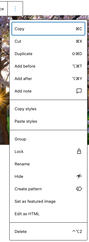
Notable Features (when you click the three dots at the end of the above Block Menu)
- Add before/after: Allows you to insert a new block above or below the currently selected block.
- Add note: Leave comments directly inside the editor to review content with your team, feedback stays attached to the block and authors are notified.
- Group: Add a group around your block.
- Hide/Show: Temporarily hide any block without deleting it to stage updates or prepare seasonal content.
- Create pattern: Save this block as a reusable element.
- Set as featured image: Set any image block as the Featured Image.
- Delete: Delete the block from the page.
Block Sidebar Menu
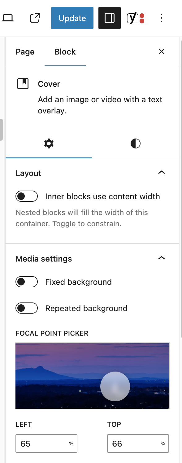
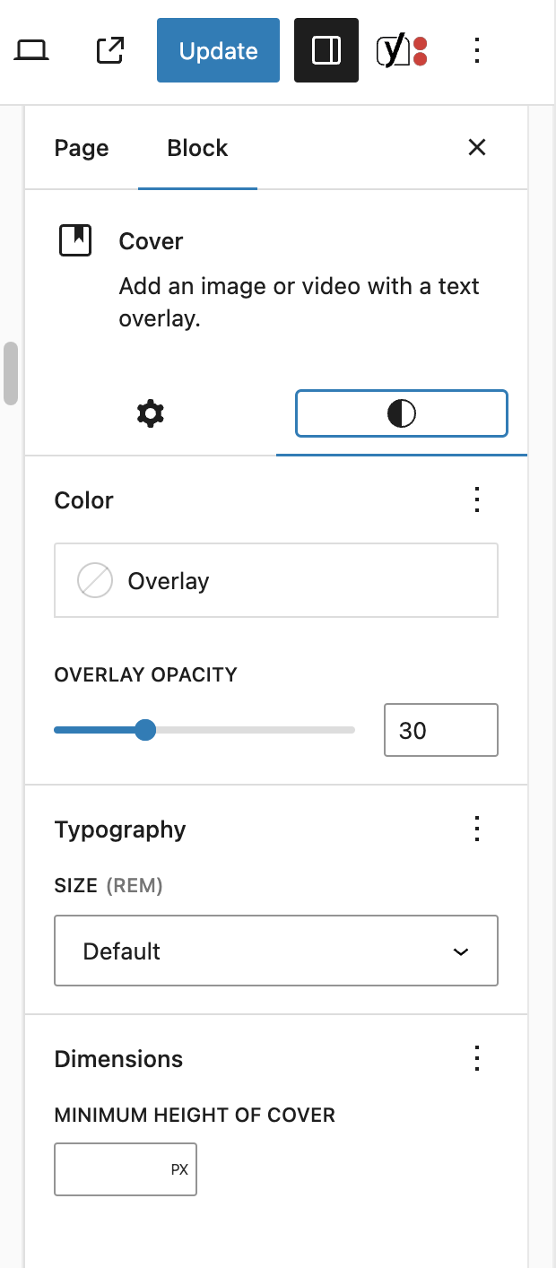
Here is where you can apply available styles and more advanced options than the smaller block menu. Make sure you’ve selected the block and toggled to the Block tab. Block Setting show under the tab labeled with a gear icon and Styles are offered under the icon that looks like a half moon.
Block Settings Tab
Block Styles Tab
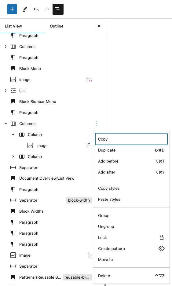
Document Overview/List View
A very helpful tool for managing your page layout is the Document Overview/List View (#4 under Top Menu above) marked by three offset lines in the top left of your editor. This allows you to see a nested list of all your blocks. It is great for selecting specific blocks and columns for changing widths and adding backgrounds. The Outline tab is important to help you maintain accessible heading levels.
Block Widths
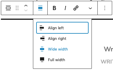
Most blocks come in three different widths, Narrow by default, Wide and Full. Text blocks like Paragraph and List are limited to only the Narrow width for legibility, but choosing Wide will make your block the width of the content area (the width of the menu) and Full will touch the edges of the screen.
For Columns and other nested blocks, you’ll need to change the width on the parent Columns, not in the individual Column. You can navigate to the parent by clicking on the “List View”, #5 under Top Menu above.
You can change the width of a block (if applicable) by clicking the Change Alignment icon above the block. NOTE: This is also where you can float the block to the left and right, but use these with caution, it allows other blocks below it to be able to flow around the block with potentially undesirable results.
Patterns
If you’d like to create a layout and save it to use again and again, then you’ll need to create a Pattern. Patterns can also be Synced so that you can make edits to that Pattern on one page and it will update on every other page where it has been added. This is helpful for something like a “Resources” sidebar that is on multiple pages where you can add a new resource link and it will update on every page.
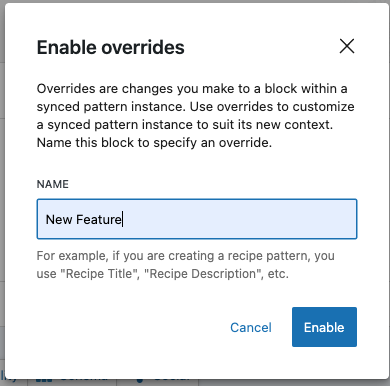
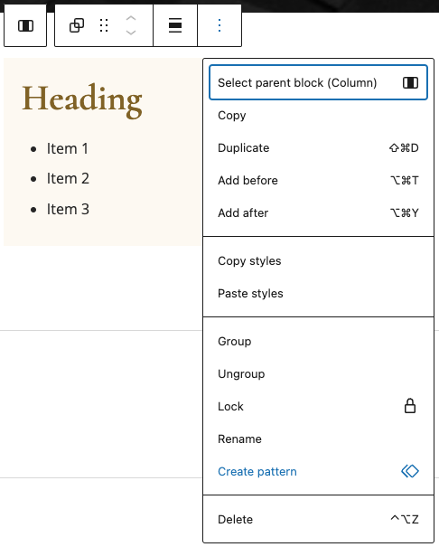
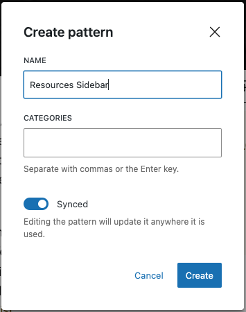
First, you’ll need to create the block once on a page, Group the blocks if more than one block is used. Then, click on the three dots on the right end of the block menu while selected and choose “Create pattern” from the drop-down menu. Then name the block in the pop-up and choose to toggle “Synced” toggle on or off.
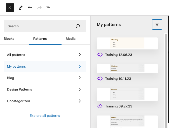
Your Pattern will now be available in the Add Block menu (large plus sign) at the top left of the builder under the icon on the far right. Your site’s Patterns should be under “My patterns” (all the other options are just messy things from our team, we’ll have more organized offerings coming soon.) If it is Synced you now can edit the Pattern on the page and you’ll be prompted to add those updates to all pages using that Patten when you save the page.
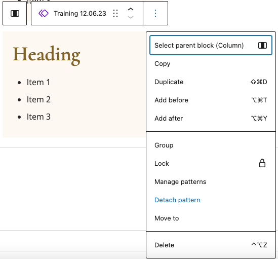
To unsync any Pattern, just click on the the same menu where you created the Pattern and choose “Detach pattern”, this will return it to normal blocks.
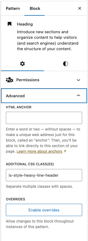
Synced Pattern Overrides
To get even more advanced, you can Sync a Pattern, and then override smaller design elements without losing the Sync. For example, if you’ve designed a stylized cover block for multiple pages, you can now edit the copy or colors in certain areas while keeping common elements synced globally.
You’ll find the Enable Overrides option in the Pattern’s Advanced settings.