
Columns
The Columns Block allows you to insert text, media, and other types of content into columns to make more complex layouts.

Detailed instructions on adding blocks can be found on Building a Page.
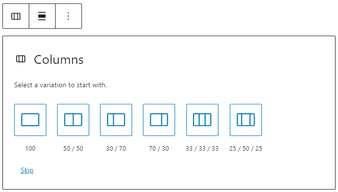
Once you add the Columns Block, you can choose a variation to start with (and you can change the number or add more columns later).
Adding Contents
Once you have defined the number of columns, you will want to add content to each column. The amazing thing about the columns block is that you can add other blocks into each column.
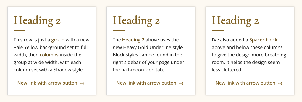
For instance, you can use the Columns Block as the structure and other blocks to create a grid of services.
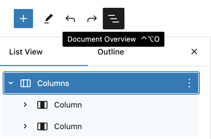
NOTE: Inside each “Columns” block are nested several “Column” blocks. If you want to change the width of the whole block you’ll need to be on the parent “Columns” instead of on an individual “Column”. You can easily select this by clicking the “Document Outline” button (three lines in the top left of your page) then going back in the builder and setting your width.
Block Toolbar
Most blocks have their own block-specific controls that allow you to manipulate the block right in the editor.
The Columns Block shows five buttons:
- Transform to
- Moving handles/change order
- Change alignment, including widths
- Change vertical alignment
- More options
Change vertical alignment
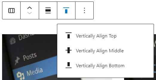
- Vertically Align Top – Make the block vertically aligned top.
- Vertically Align Middle – Make the block vertically aligned middle.
- Vertically Align Bottom – Make the block vertically aligned bottom.
Block Settings
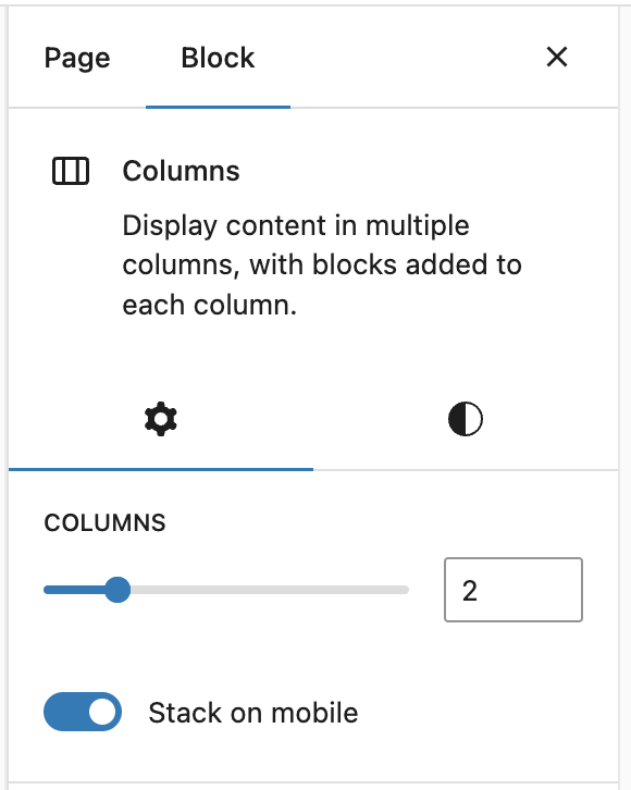
Columns
The Columns block offers a slider to change the number of columns and a toggle that allows them to stack on mobile. For the styles, you can set the color of the background.
Column
On the individual Column blocks inside the Columns you have different settings.
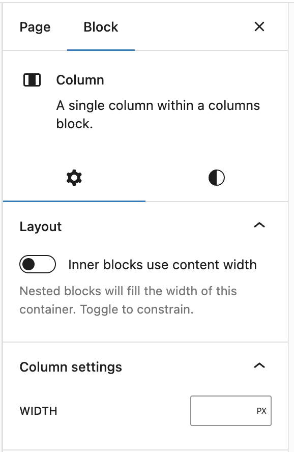
Layout Settings
You can toggle the Column to fill the space or manually set the width.
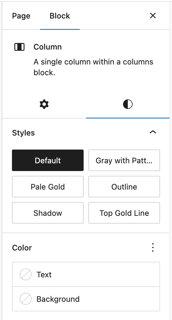
Style Settings
Styles
- Default: The column will have no background.
- Gray with Pattern: The column will have a border, gray background, and the fading ironwork WFU branding.
- Pale Gold: The column will have a light gold background.
- Outline: The column will have a light gray, thin border.
- Shadow: The column will have a small shadow around the outside.
- Top Gold Line: The column will have a bolder gold line on top and a light gray, thin border around the other sides.

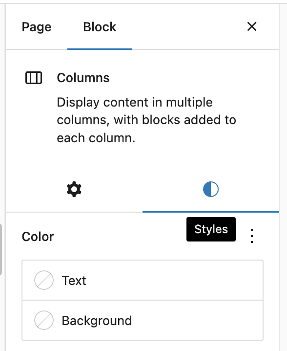
Colors
Here you can choose the text and background colors.
NOTE: Accessibility criteria are built into the new editor to warn you when the text color combination becomes illegible for persons with reading impairments.