
Accessibility
The goal of this WordPress theme is to be as accessible as possible for users of all abilities and every effort has been made to accomplish that goal. While not perfect, we’re committed to constant improvement and updates as new information and technologies become available. But we are not able to automate all aspects of accessibility, so as a content editor in this theme we’ll need your help with this goal in the areas below.
Learn more about accessibility on the web and for technology by visiting accessibility.wfu.edu.
Image Alt Text
Every photo that adds meaning to the page should be given concise meaningful Alt Text. Alt Text should briefly convey the contextualized message of the photo, which makes the meaning of the image available to more users, including those using assistive technology such as screen readers. Ensuring the meaning of images is conveyed via Alt Text aligns with the Americans With Disabilities Act.
This phrase or sentence only needs to be a short phrase that conveys the message of the photo in its context. It should not duplicate nearby document text. Images that do not convey meaning and are purely decorative should be left blank. The W3C has produced a decision tree to help you decide if an image is truly and purely decorative or has meaning.
Exception: Linked images. If an image or slide functions as a link, it must always include meaningful Alt Text or a visible caption, even if the image appears decorative. In this case, the Alt Text should clearly describe the destination or purpose of the link so that screen reader users understand what clicking the image will do. Avoid generic text like “click here” or “image link.” Instead, use descriptive phrases like “Read about our Summer Program” or “Download the Admissions Viewbook.”
Video/Audio Closed Captioning
Ensure all videos on your site, whether from YouTube, Vimeo, or Kaltura (shared via your University account), include closed captions to make them accessible to all users, including those with disabilities.
Most services provide automatic captions, which you can edit for accuracy. For professional captioning, UMC offers recommended resources, contact us for guidance.
For audio content, including the Audio Block or external services, provide a transcript. Affordable transcription services are available, and most digital audio formats can be adapted for captioning. If needed, use an Accordion or Details Block to display transcriptions unobtrusively.
Using Good Heading Structure
Headings levels (H1, H2, etc.) should be used to organize sections and subsections in a nested format similar to an outline. Using good heading structure with proper nesting, and not skipping levels, makes your content more organized and navigable for those using assistive technology, like screen readers. Tools provided to help maintain a good heading structure are explained on our Heading Block page. Headings also have different visual appearances, which signal content changes for visual engagement. The main page title of your WordPress page will receive an H1, thus, all content should begin with H2.
Color Contrast
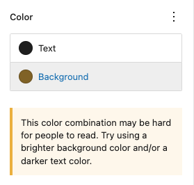
Website visitors with certain visual disabilities can struggle to perceive content on the page if there is not enough color contrast between the content and its background. Our default theme colors have been tested to be WCAG 2.2 AA compliant but the editing freedom of this theme allows users to create non-compliant combinations.
However, the theme will show a warning in these circumstances, it is the user’s responsibility to resolve these warnings and maintain an accessible experience for all website visitors.
Opening links in a new tab or window
Having your links open in a new tab or window is usually considered inaccessible. It can be disorienting for people with low vision who are navigating via a screen reader or for users who might not understand that they cannot use the “back” button to return to the previous page.
We have added an automatic indicating icon ( ) and screen reader label as an aid for the few acceptable scenarios where you could set your links to open in a new tab:
- When the user is working on a task that should remain open (e.g., filling out a form or composing a message). Opening a new tab for a reference link can prevent accidental loss of progress.
- When linking to non-HTML documents or files (such as PDFs, Google Docs, or downloadable content). This avoids disrupting the current browsing session.
- When linking to external sites that are outside your site’s main scope, especially if returning to your site afterward is likely.
PDFs
PDFs are often extremely problematic for users who navigate using a keyboard or screen reader. Please consider building your PDF content in a web page or Google Doc if possible. Contact Wake Forest’s Technology Accessibility team for help in creating more accessible PDFs if your project requires them.