
Details Block
Use the details block to display additional details or controls related to your page content. This block provides a visible summary label and a hidden content area; users can toggle the content area visible by clicking the summary label.
The details block is not appropriate for footnotes, and is similar in function to an accordion.
Example:
In Summary… a details block in action!
Use the Details block when you need a simple and accessible solution for toggling content open and closed without complex styling requirements. Use Accordions if you want to link directly to specific content or just want a little more pizzazz!
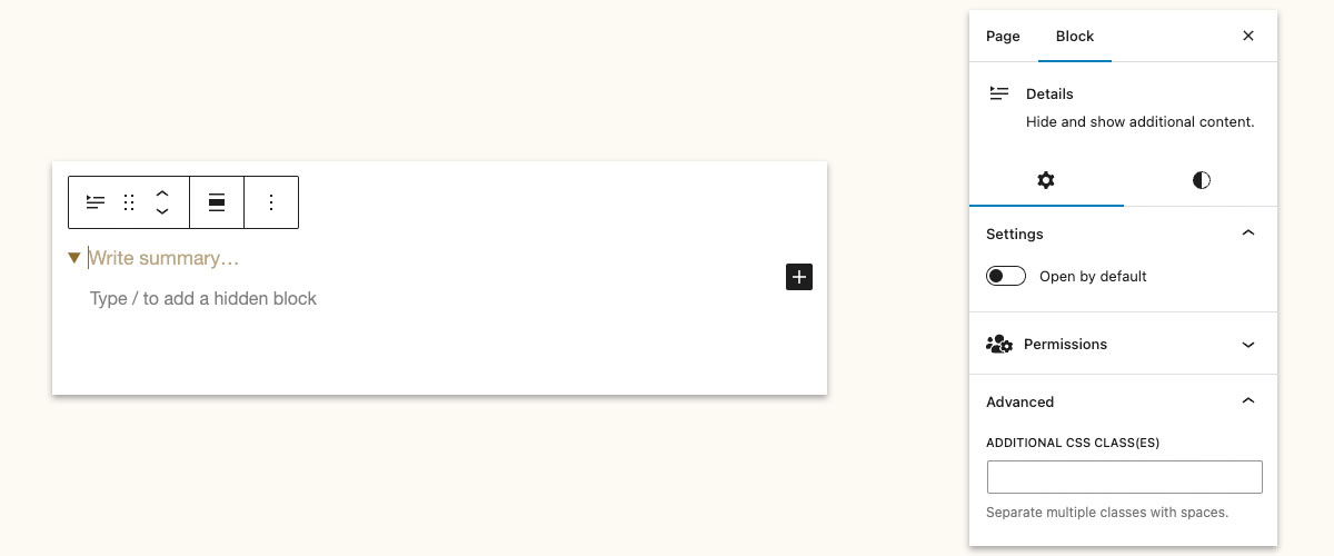
Block Settings
Summary Label: This is the “title” or “heading” that invites users to read more about a particular piece of content.
Hidden Content Field: This is where you add additional blocks that will be hidden from view. While this field can accommodate any number of additional blocks, it’s best to keep this area brief.
Open by Default setting: In the block settings panel that appears on the right of the dashboard, you can click the toggle and the hidden content will be visible by default.
Adding Content
To add content to the details block, type your title into the summary field. Then, click in the white space below and use the plus sign or the / commands to add the blocks of your choice. You may add any block you want to the hidden content section.