
Button Card Block
The Button Card Block allows you add a row of “cards” that each link to a URL of your choice. This is a stylish way to display your unit’s services, degree options, resources, and more!
Example:

Headline one
A brief paragraph of 30 words or less.

Headline two
A brief paragraph of 30 words or less.

Headline three
A brief paragraph of 30 words or less.
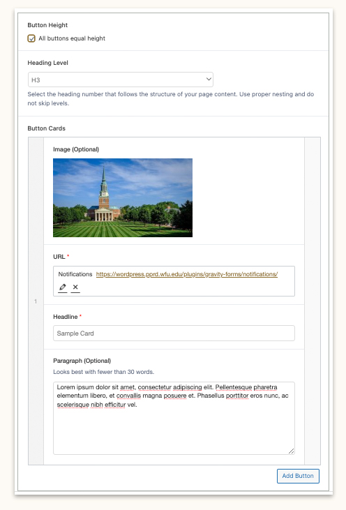
Block Settings:
Button Height: Checking this box will equalize the card heights regardless of how much content is added to each.
Heading Level: Select the heading number that follows the structure of your page content. Use proper nesting and do not skip levels. The default level is H3.
Button Cards: The block repeater field for each card. Allows up to 4 items.
- Image: Adds an image above the heading. Images are optional.
- URL: Required link for the card.
- Headline: Required title for the card.
- Paragraph: Short blurb that displays under the heading. Paragraphs are optional.
Best Practices:
- Keep it succinct: Shorter blurbs are better! Try to keep your bite-size copy under 35 words.
- For accessibility reasons, do not convey new information in the images. The images are meant to be decorative.