
Grid Block
The Grid block makes it easy to create flexible, multi-column layouts on your web pages. You can access the Grid block directly from your block editor.
Detailed instructions on adding blocks can be found here.

Year Founded:
1834
(Wake Forest, North Carolina)
Relocated to Winston-Salem, North Carolina in 1956.
Nickname:
Demon Deacons
Motto:
Pro Humanitate
(For Humanity)
Career Outcomes:
96% of graduates over the last 10 years are employed or in grad school within nine months of receiving their degrees.
Basic Grid Layout
The grid block begins with three empty blocks and you continue to add blocks as you need them. This example grid below contains twelve individual paragraphs. By default, each grid is uniform in size. If you scale this browser window or view this page on a small device, you’ll see how the grid reflows so that the content remains readable.
Each box in the Grid is just a single block, so text layouts are still limited in this new feature, but incorporating image and cover blocks can lead to interesting layouts. The background color on the squares is achieved by setting the background color on the text block.
Grid Item
Grid Item
Grid Item
Grid Item
Grid Item
Grid Item
Grid Item
Grid Item
Grid Item
Grid Item
Grid Item
Grid Item
Advanced Grid Layout
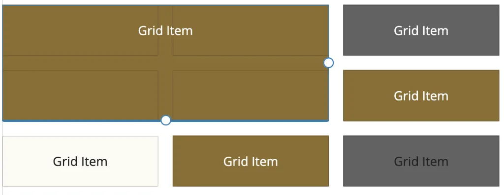
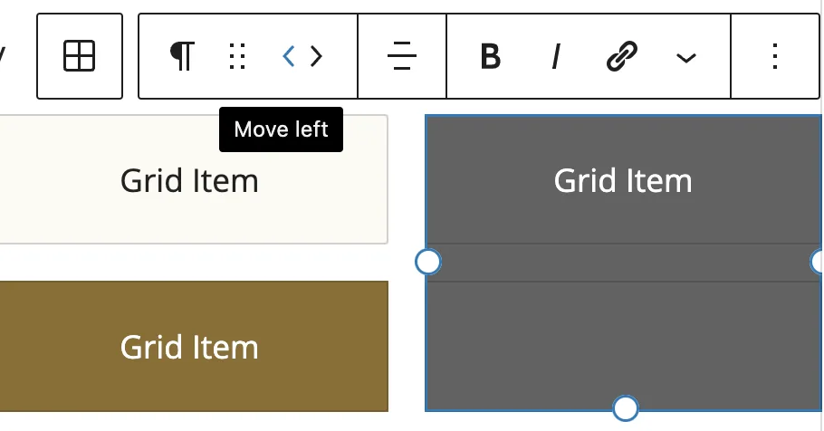
What’s unique about Grid is that each element can be sized individually by clicking and dragging the handlebars that appear when you hover over an element. For instance, the grid example below consists of seven individual paragraphs. The first paragraph element has been dragged down and left so that it takes up 4 spaces of the grid. Other grid elements have been adjusted horizontally and vertically to take up two grid spaces.
Grid Item 1
Grid Item2
Grid Item 3
Grid Item 4
Grid Item 5
Grid Item 6
Grid Item 7
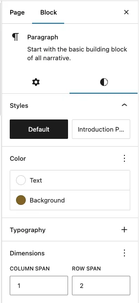
If you are struggling with using the handlebars to drag the layouts, you can also try the “Dimensions” settings in each block’s square to manually set how many Columns (vertical) or Rows (horizontal) the square will expand across the grid. Think of the grid as a spreadsheet and you are merging the cells.