
Buttons
The button block allows you to add links as buttons or call-to-action items on your website.
The video below shows you how to use the Button block, but was created before the new styles and other updates.
Detailed instructions on adding blocks can be found on Building a Page.
Block Settings
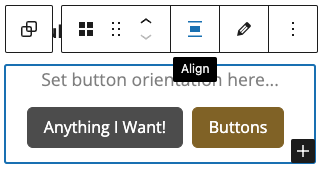
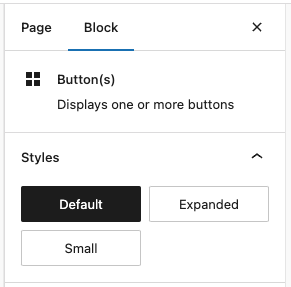
Button Group
This is the level where you set your button orientation in the builder:
The options at this level are for all buttons in the group:
Default: The buttons will appear with default padding.
Expanded: The buttons will be full-width to the container.
Small: The buttons will appear smaller than default.
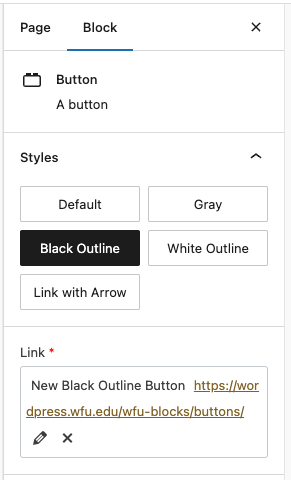
Button
The individual buttons are editable within the Button Group with these options:
Styles:
Default: The button will be gold.
Gray: The button will be gray.
Black Outline: The button will be transparent with a black outline.
White Outline: The button will be transparent with a white outline, this should only be used on dark backgrounds.
Link with Arrow: The button will be gold text with a dotted underline and an arrow that animates on hover.
Link:
This is where you set each Button’s text and link, by clicking the pencil.
Examples:
Default
Expanded
Small
White Outline (for dark backgrounds only)