
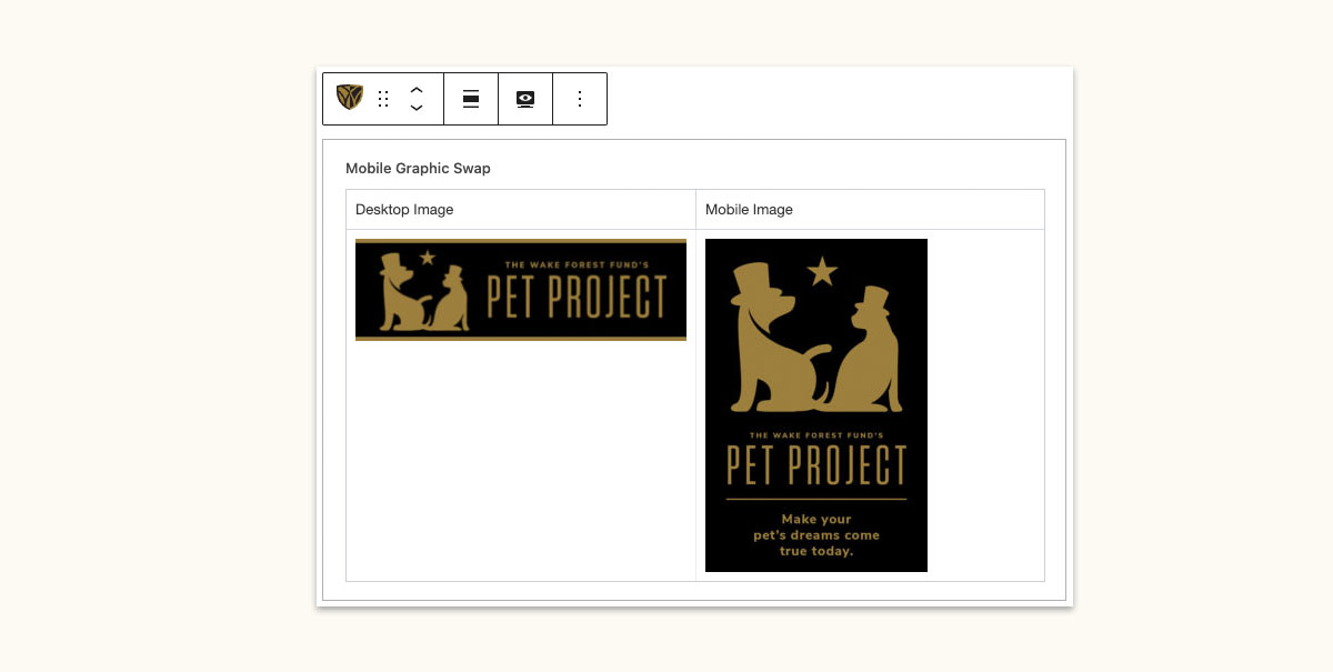
Mobile Graphic Swap Block
Use the mobile graphic swap block to change images based on your users’ device. Many times on mobile devices, the details on a horizontal banner will be too small to see; switching to a mobile friendly version of the image will solve the issue!
Try me!
Change the size of your browser window to see how the image changes.

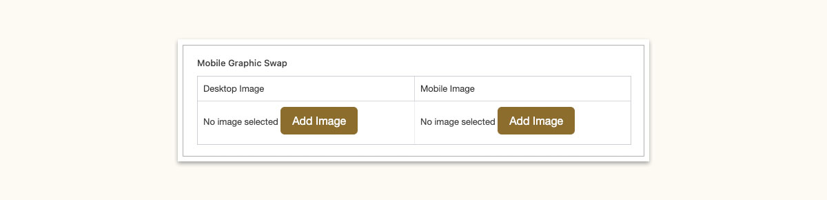
Block Settings
Desktop Image: The image you would like users with larger screens to view.
Mobile Image: The image you would like users with smaller screens to view.
Align Options: Use the Align option on the toolbar to set the width of the images. The options are none (narrow width), wide width, and full width. You can also float the images left and right.