Group
The Group block allows you to group different items together and add a background color or style. You can also group items and save them as a reusable block.

Wake Forest students walk through a tunnel of bright yellow gingko trees on their way to the library, on the campus of Wake Forest University.
To add a group block, click on the Block Inserter icon.
You can also hold down shift and select multiple items, then choose the “Group” option from the menu:

Detailed instructions on adding blocks can be found on Building a Page.
Block Toolbar
Most blocks have their own block-specific controls that allow you to manipulate the block right in the editor. The group block offers standard block options as well as full-width and wide-width options.
Editing the block
The nice thing about the Group block is that you can add any other blocks inside the group block and create a layout of your own. To add blocks to the Group block, click on the add inserter icon inside the Group Block.
Adding Content
Inside the group block, you can add a columns block, cover block or any other available block to create the layout of your choice.

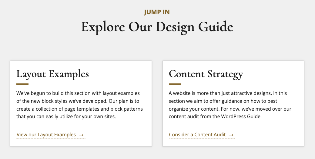
The group block shown above is full-width, has a gray background and contains a wide-width double column with headings, paragraphs and button blocks.
Block Settings
Every block has specific options in the editor sidebar in addition to the options found in the block toolbar.

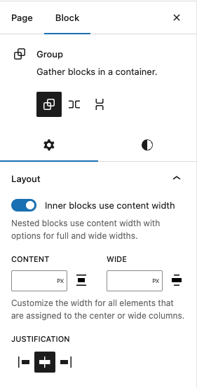
The “Inner blocks use content width” toggle forces all inner blocks to be the same width as your group, if you would like to set your inner blocks to have their own smaller independent width then leave this off. The “Content” and “Width” fields allow you to set a custom group width.
Style Settings

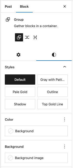
- Default: The group will have no background.
- Gray with Pattern: The group will have a border, gray background, and the fading ironwork WFU branding.
- Pale Gold: The group will have a light gold background.
- Outline: The group will have a light gray, thin border.
- Shadow: The group will have a small shadow around the outside.
- Top Gold Line: The group will have a bolder gold line on top and a light gray, thin border around the other sides.

Note that since the group block has the ability to embed other blocks, if you click specifically on one of the blocks, the settings in the sidebar will change according to the block you added to the group block (e.g. if you added an image inside the group block, when you click on the image the sidebar will display the options from the image block settings).
Color Settings
Here you can choose the text and background colors.
NOTE: Accessibility criteria are built into the new editor to warn you when the text color combination becomes illegible for persons with reading impairments.
Background Image
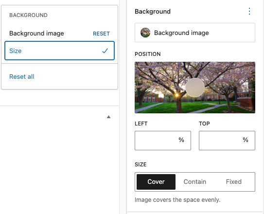
You can also add an image as the background of your group, it will be a responsive image “cropped” by the viewing device and the width of the area, so choose a more “textural” option. You can also click the three dots to the right of “Background” and check “Size” for more layout options:


