WP 2.10.7 Deployment
Today’s deployment was all about boosting performance. Over the past few weeks, we’ve identified inefficiencies in our server environment that were consuming excessive resources. We’ve been working closely with the IS team to resolve these issues, and since the deployment, database usage has dropped significantly. This should result in a faster, more responsive experience for our editors, especially those who were facing slow page loads and extended save times.
Additionally, with the launch of the University Marketing and Communications (UMC) website, it was time to retire the legacy Communications and External Relations (CER) websites. In this deployment, all links to the CER sites, including digital support requests, will now be redirected to the UMC website.
Building an Accessible Web: Tips & Reminders
Visitors with certain visual disabilities may struggle to perceive content if there isn’t enough color contrast between the text and its background. While our default theme colors have been tested for compliance, the flexibility of this theme allows users to create non-compliant combinations—particularly when text is overlaid on images.
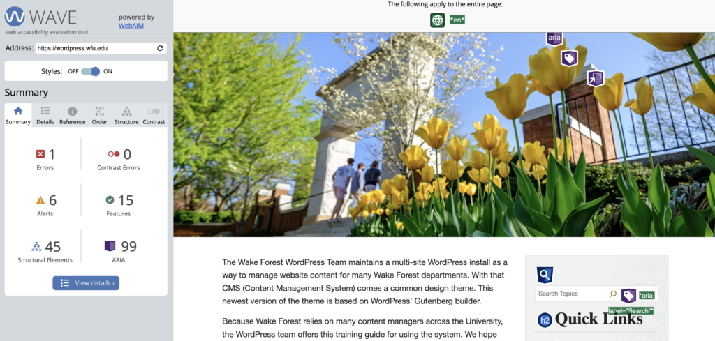
Whenever you place text over an image, it’s crucial to ensure sufficient contrast. You can easily check this using tools like WAVE. Simply enter your URL, and it will generate a report highlighting any “Contrast Errors.”

If the WAVE tool identifies contrast errors, there are a few ways to resolve them. You can adjust the text color or the background to create a higher contrast. Another option is to add a semi-transparent overlay between the text and the image to enhance readability. If the design allows, consider repositioning the text away from busy areas of the image or simplifying the background. Ensuring your content is accessible to all visitors is key to creating an inclusive web experience.
Learn more about accessibility on the web and for technology by visiting accessibility.wfu.edu.
Categories: Deployment

